Aureon Parfumes
Aureon Parfumes is a luxury fragrance brand focused on refined, modern perfumery.
Services
Product Photography
Category
E-commerce imagery
Client
Erik Hertel


Project overview
Aureon Parfumes is a luxury fragrance product positioned within the contemporary premium segment, where visual language plays a decisive role in shaping perceived quality and trust.
The project was developed as a commercial-oriented exercise, structured to reflect the conditions of a real brand scenario rather than an abstract visual exploration. The intent was to create imagery that could function immediately within brand communication, not images that require explanation to be understood.
Only after defining this practical requirement did the conceptual problem emerge: how to establish credibility in a category often dominated by excess, symbolism, and visual overstatement.
Product and market context
The fragrance market operates on a balance between emotion and discipline. While the product itself is sensorial, the visual codes of the category demand restraint, consistency, and long-term reliability.
For this reason, the project deliberately excludes visual tropes such as hyper-dramatic lighting, aggressive contrasts, and overt narrative devices. These choices were made to avoid images that feel seasonal, trend-driven, or overly expressive.
What remains is a visual language that positions the product as confident and composed, allowing material presence and proportion to carry meaning.
Photographic objective
The photographic objective was to construct a perception of controlled intimacy: a sense of closeness without intrusion, warmth without expressiveness, and premium value without monumentality.
This objective translated into images that emphasize presence rather than action. The product is not shown in use, staged within a narrative, or framed dynamically. Instead, it is given visual stability and space.
This decision supports commercial contexts where images must remain effective across time, formats, and repeated exposure.

Visual concept and image construction
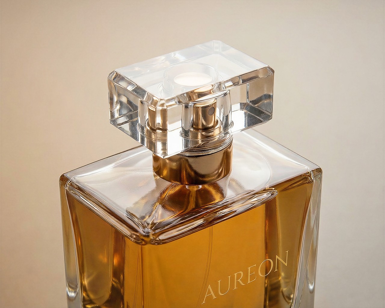
The visual concept is based on reduction and selection. Rather than adding elements to create meaning, the process focused on identifying what could be removed without weakening the product’s presence.
Compositions were designed to keep the bottle visually central while maintaining a clear relationship with the surrounding space. The environment is never decorative, but structural.
By avoiding exaggerated angles, tight crops, or expressive framing, the images maintain continuity and visual calm.
Light, materials, and image discipline
Lighting decisions were driven by material behavior rather than mood alone. Soft directional light preserves volume and surface quality while avoiding flattened forms or cinematic emphasis.
Reflections were controlled but not eliminated, allowing glass and liquid to retain physical realism. Color variation was deliberately limited across the set to avoid visual noise and ensure cohesion.
Camera position, scale, and perspective were kept consistent to allow the images to operate as a repeatable system rather than individual interpretations.

System coherence and intended usage
The images were conceived as a modular system rather than standalone shots. Each frame follows the same spatial logic, light behavior, and framing principles, enabling flexible use across different formats.
This structure allows the visuals to be adapted for layouts, crops, and sequences without requiring reinterpretation or loss of identity.
Usage scenarios
The project is designed for application across website hero sections, e-commerce product pages, and digital campaign assets, where visual consistency directly impacts credibility and conversion.

